03/02/2020 - Fixes And Space Stations


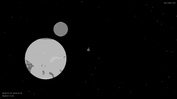
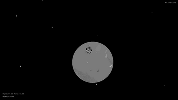
First of all, some new screenshots. I always like seeing new patterns and things and sometimes you get some interesting spawns.
Fixes To Star System
After continued testing with my spawners, I realised there was an issue where increasing the playfield's size would mean that the segments would very large, meaning that the stars and planets would be more spaced out than I wanted. So I made a change to the code that now specifies how many segments there should be based on the size of the playfield. You can see the updated code here. Again, I'm using Pastebin.
Other Fixes
I completely re-wrote the code for the "force stop" function of the player ship. To clarify, this is basically the brakes, it slows down the ship when pressed. Previously, it only slowed down properly when in certain parts of the map, and when it did it would rotate the player to a forward facing position. Now it properly points the ship towards the vector of movement and applies negative thrust, slowing the ship down properly. However, while fixing this, I noticed that the sprite animations were not correct when within negative positions (As in below 0 on each axis within Unity's world space). I had to make a slightly hacky solution to that by giving the animation system a different velocity variable depending on the position of the player. It works, but I think I could have handled it better.
Space Stations

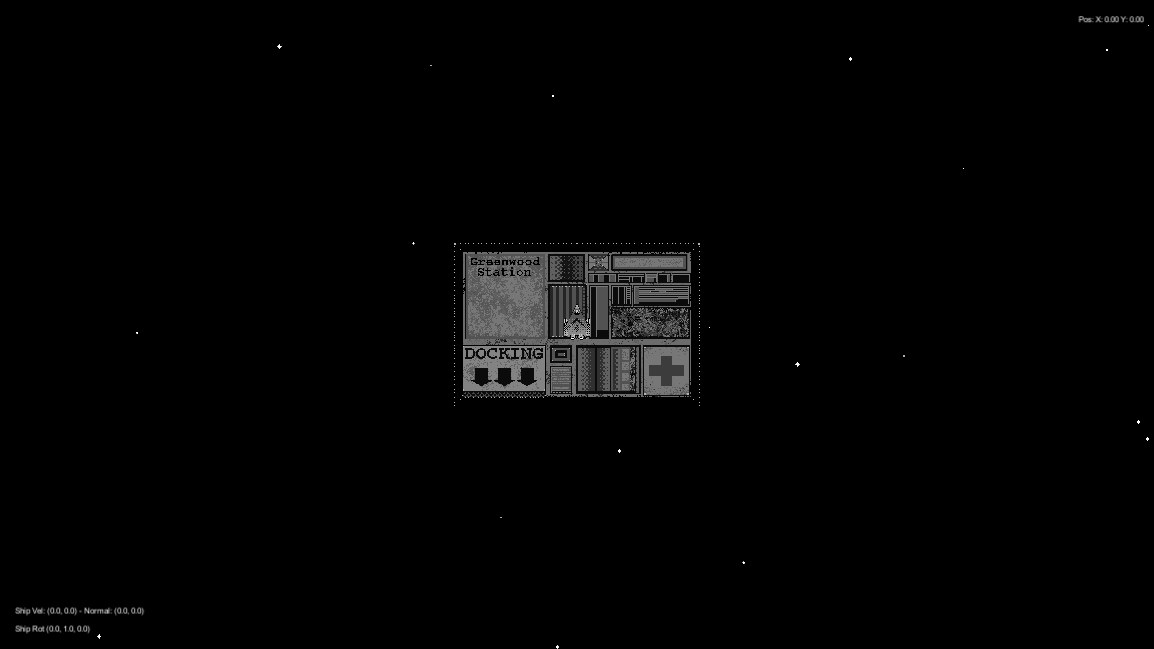
Here's a (slightly outdated) image of what it going to be the player's "Home Base". When the player gets in close they will be able to dock and then interact with the station by taking on jobs, making upgrades and repairs, and so on. There is another station made that is circular and has a rotating section, but I'm going to show this post as there is more work to be done on it. Additionally, I want to give a general second draft to a lot of the art in the game, especially the stations.
On The Subject Of Art
Although I haven't received any complaints about this, I think that the general art style is quite noisey. Differentiating between the player and the background can be quite difficult at times. Additionally, zooming out causes visual artifacts that may border on being dangerous towards epileptic individuals.
As I said, I need to do a second pass with a lot of the art, maybe think about using a blurring shader to make some of the zooming in a little less problematic. I may also disable zooming in entirely and go with a fixed resolution and re-adjust all the art to work with that. That said, contrast between the player, background, and foreground still need to be dealt with. I might look into lighting models with sprites to help produce shadows to make the player stand out more, or see what I can do with outlines. It's something I will think about after Demo Day 32 I think.
Progress Towards Demo Day
Things are going well. I still need to set out what I want to have working for the demo and what can wait till later. But I feel that I can do a reasonable amount to meet the standards needed for a demo. I've got under two months to get it to that point, so I'll just keeping working at it.
That's all for now, next post should have some new art stuff or maybe some UI changes.
Get Space Cart
Space Cart
Space Trucking. Space Exploring.
| Status | Canceled |
| Author | ADMAN |
| Genre | Adventure |
| Tags | Exploration, Grayscale, Space Sim, Trading |
| Languages | English |
| Accessibility | Configurable controls |
More posts
- 01/07/2021 - Space Cart Is (Not) DeadJul 01, 2021
- 15/02/2021 - Post-Demo DayFeb 15, 2021
- NEW DEMO OUT!Jan 01, 2021
- 17/12/2020 - Progress For Demo Day 36 Goes WellDec 17, 2020
- 05/11/2020 - TapedeckNov 05, 2020
- 08/10/2020 - A Round Of TweakingOct 08, 2020
- 26/09/2020 - Charted!Sep 26, 2020
- 10/09/2020 - Store's Open! (In-Game Currency, NO MTX - EVER.)Sep 10, 2020
- 13/08/2020 - Now Supporting ControllersAug 13, 2020
- 14/07/2020 - Survival SystemsJul 14, 2020
Leave a comment
Log in with itch.io to leave a comment.